 Worximity1 of 1
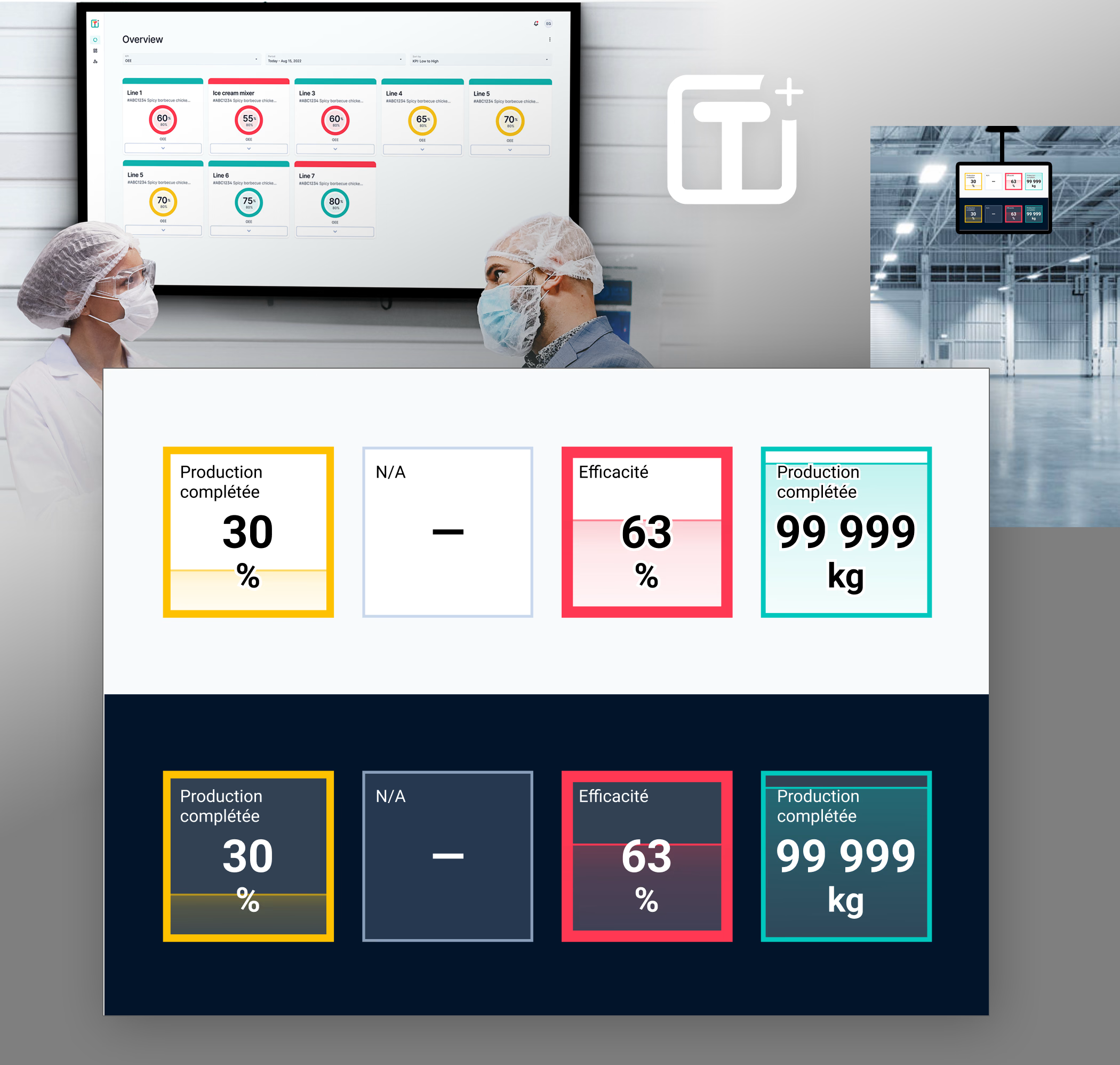
Proposed UX and UI concepts to the design team
Production line operators had to leave their workstations and walk up to the screens to read the dashboard’s key performance indicators (KPIs).
Everyone liked the interface’s look but found the key data hard to read.
A review of the visual design shows that the circles waste nearly 25% of each card’s space. The product name, Tile+, also suggests tiles, which means squares.
My visual layout is kept minimal:
1. The title sits in the top-left corner, the large value in the center, and the unit on the third line.
2. The percentage appears in the background as liquid filling its container. This level stays visible from a distance, even when the numbers become unreadable.
3. An “out of service” item stays subtle so it doesn’t get in the way of reading the others.
* Yellow on a light background will ALWAYS lack contrast. I recommend adding magenta to push it toward orange, as most Material Design themes do.